
Why Accessibility is essential
According to the World Health Organisation (WHO) over 1 billion people live with some form of disability. Specifically in the UK latest estimates from a recent government survey indicate that 14.6 million people had a disability in 2021 – 22% of the population.
That’s 22% of the UK population that are trying to access the web, but may be hitting barriers because of a lack of accessibility. However, when Tim Berners-Lee created the World Wide Web, he was determined that it should be easily accessible by all. He famously said “The power of the Web is in its universality. Access by everyone regardless of disability is an essential aspect.”
Web channels that are designed badly only serve to exclude those with varying disabilities accessing and engaging with your content. Therefore in many situations web accessibility is a requirement by law.
However, there are other reasons why we should be thinking accessibility first, including creating better customer experiences and in turn greater commercial opportunities.
Email marketing is an important web channel that should follow the same guiding principles. Create your emails with accessibility at its core and not only will you not exclude over 20% of your potential audience, you positively create great experiences for all, that leads to increased customer lifetime value.
Ensuring that your emails are accessible is not just a nice to have, it is business essential.
- The 6 accessibility conditions
- Best practices
- Accessibility at Jarrang
The 6 accessibility conditions
According to Email on Acid there are 6 main accessibility conditions we need to be thinking of when it comes to email marketing:
- Cognitive – There may be difficulties with problem solving or comprehension. Think about simple presentation, using clear instructions and avoid technical language.
- Auditory – There may be difficulties with hearing. Think about video captions and podcast transcripts.
- Neurological – There may be difficulties that affect the central and peripheral nervous system. Think about ensuring your email is easy to navigate and break text up into smaller sections.
- Physical – There may be difficulties with motor control. Ensure your content can be engaged with keyboard navigation and screen readers.
- Speech – There may be difficulties with speaking. When driving to a call to action ensure there it a contact form or live chat.
- Visual – There may be difficulties with loss of vision and sensitivities to light or colour. Ensure your emails are compatible with screen readers, font sizes and CTA buttons are large enough.
Let’s look at a few key best practices you need to be thinking about to ensure your emails are accessible.
Best Practices
Accessibility led Design
From images to the structure of emails, there are many elements you should be thinking of when creating the wireframes of your email marketing templates to ensure they are accessible. Here’s a few to get you started:-
- Stay away from image only emails – Whilst they might be hugely visual, using only images in your emails is far from accessible. Ensure your copy is included as live text. This example from Litmus demonstrates the point well. Not only does the use of only images go against general email marketing best practice, but doesn’t give a screen reader much information about the email when reading your email to someone who is visually impaired.

- Keep a clear structure - Think about how your emails will display when responsive and how text will sound when it is read by a screen reader (from left to right). Ensure that the content follows a logical structure when displaying content.
- Use clear heading hierarchy – The headers in your email should allow the reader to easily understand what they should read first and where to go next. A great way to do this is through clear heading hierarchy - Heading 1 : Heading 2 etc
- Clear CTA buttons and text links – Ensure link text is meaningful and informs clearly about the destination. Remember don’t rely on colour to distinguish text links, underline them as well.
- Avoid flashing images in animation – Flashing images can cause seizures. It is recommended that you don’t include flashing images, or if you must at least give the reader the option to turn it off.
Colour
The contrast ratio of your emails not only affects those with visual impairment, but also affects everyone in different ways.
Here’s a great example of how different coloured text on different backgrounds can affect how clearly you can see the elements.
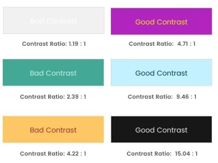
Aiming for a high colour contrast will ensure that the two colours don’t blend to create a blur. Here’s a tool you can use to ensure you’re using the right colour contrast ratio.
The below example demonstrates how an email might look to someone with colour blindness (email on the right). Notice how the colours no longer standout and are more muted.
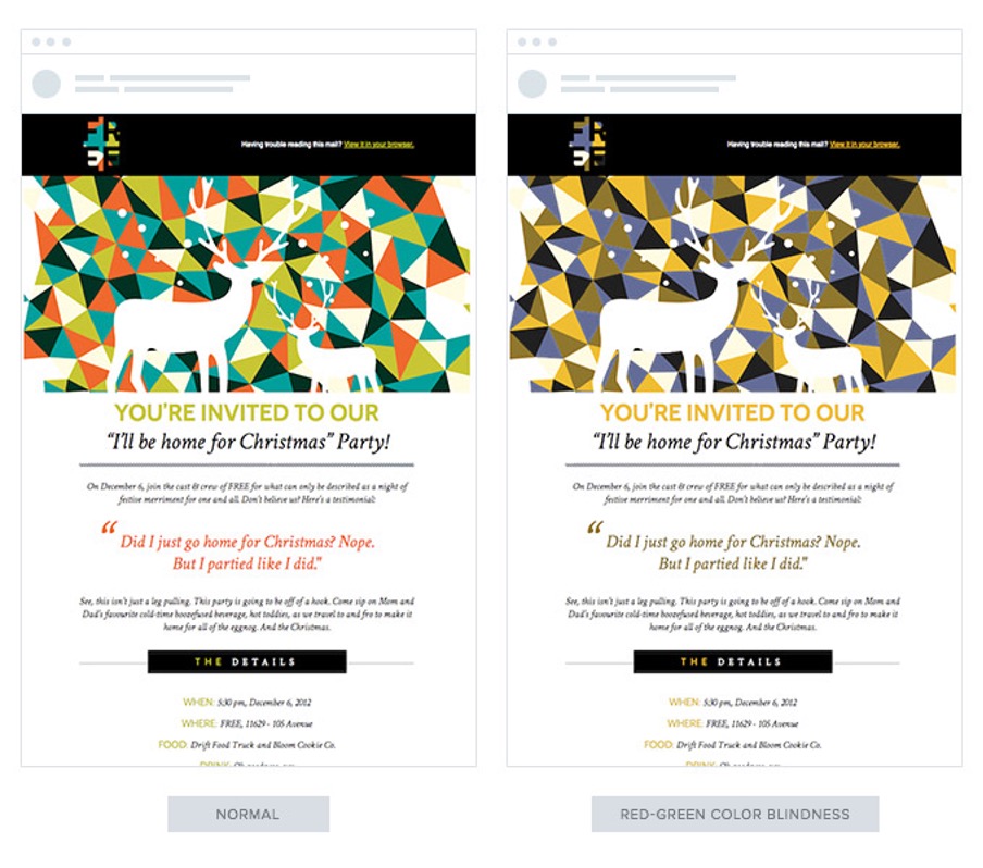
It’s also important that when designing for dark mode you consider the best colour contrast, test different versions.
Readability
Readability is a key consideration for both accessibility and user experience. It means making sure that all audiences can read and understand what you’re writing. It includes the language you use, the structure of the text and the way you organise and present content. Here’s a few tips.
- Use descriptive subject lines and pre-headers – these are the gateway to your brilliant email marketing content, so ensure you are creative but are clear and concise. Remember a great subject line is not only good for accessibility but can lead to fantastic email campaign results!
- Do not centre paragraphs of text – Many people, especially those with dyslexia, find it difficult to easily read multiple lines of centred text. The below example demonstrates this point well.

- Avoid using all caps – Not just because it comes across as you’re shouting, but when all words have a uniform rectangular shape readers are unable to easily read them.
- Use alt text for images – With images switched off, or for screen readers, use descriptive alt text to describe the image. If there is no alt text there is a blank space or your screen reader just says “image” when scanning your email for content. Remember, don’t describe the image but what the image does. For decorative images it is recommended to leave these alt text free.
Accessibility at Jarrang
At Jarrang we’re passionate about accessibility. In fact all the templates built by our creative team are accessible as standard. If you’d like to discover whether your emails will pass accessibility best practices talk to one of our friendly team about our email marketing accessibility audits.
Subscribe to our insights newsletter
Be the first to know what's trending in email and CRM.
Share this story
Related insights


Article 5 min read
